


The results

The refreshed brand was rolled out across all touchpoints, including the design and development of a completely new website.



Further developing identity through brand refresh
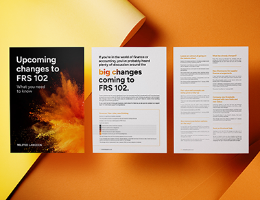
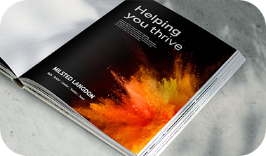
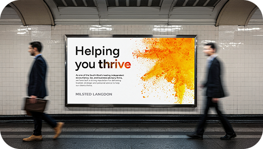
Creating a more dynamic and recognisable visual style through an in-depth brand refresh that built on previous successes.

We first rebranded Milsted Langdon in 2020, marking a significant evolution from their previous identity. Six years later, the brand was ready for a refresh and we were tasked with further developing its visual identity to ensure Milsted Langdon remained competitive while retaining the recognition and equity built over time.
There was a need to build upon the previous rebrand to ensure that the initial investment still had value. This was placed alongside the need to preserve the reputation the client had built, so the brand identity could not change too much as this might disrupt their presence in the market.
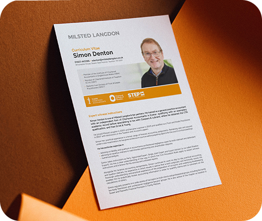
We retained the distinctive colour palette and minimalist approach to imagery, while introducing bold, abstract and textural photography to create a more dynamic and recognisable visual style. The typography was also updated to complement the rounded corners that have become a defining feature of their marketing materials.
The refreshed brand was rolled out across all touchpoints, including the design and development of a completely new website.
The feedback

We have been shortlisted for a Midlands Marketing Award after helping a family-run care provider use AI search, digital strategy and storytelling to compete with some...

Recruitment in the care sector is notoriously hard and when we do marketing for this industry it’s always with employer brand in mind. Care providers are...
